
Blackboard Data
Category User Research, Data & Analytic
Role Senior Designer
Timeline 2018Q1 – 2018Q4
In the spring of 2018, I was placed on a small team to create a brand new data and analytics product that would unify information being collected across Blackboard. We worked together to identify customer core needs, conceptualize solutions, and ultimately delived an MVP of the Blackboard Data product to market for testing with alpha users.
The problem
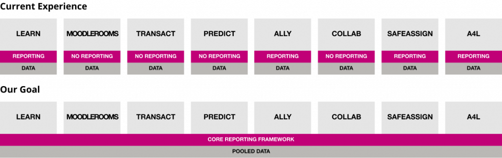
Blackboard owns a variety of different software tools and therefore a tremendous amount of data. However, unless they had the knowledge and capacity to translate that raw data into actionable reports, it was useless. We also had no understanding of how our users were utilizing the raw data they had access to (and therefore no tangible ideas for a solution).
Research
Contextual inquiries
We performed 5 remote inquiries at 4 different universities. Each were recorded, 90 mins conversations that covered a wide range of topics from Data Architecture and Consolidation to Report Generation and Analytics Education.
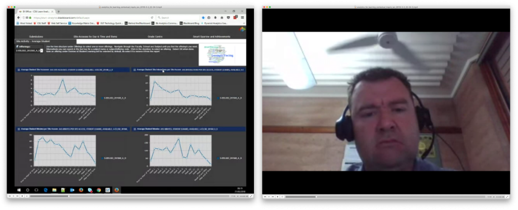
Contextual inquiry with research participant
Analytics Questionnaire
We got some of our users to fill out information answering specific questions we had about how they use analytics, the specific tools that they use, and what kind of struggles they have in their day to day work.
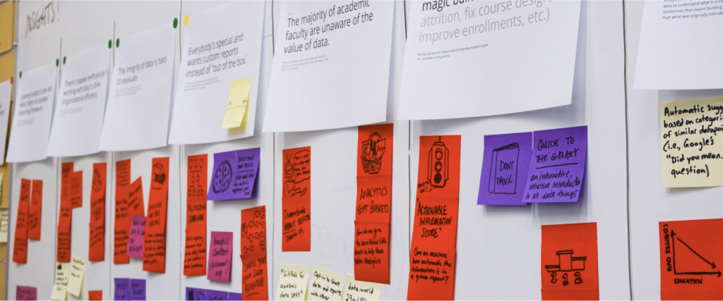
Close up of whiteboard with research insight post-it notes.
Insights
Learning Analytics is the Wild West with minimal standards around data management and reporting.
Currently, there’s no standard framework for reporting creation. Organizations build custom reports as requests come in with many different tools.
While data promises to drive organizational efficiency, working with data is massively inefficient.
By its very nature, utilizing data is difficult and requires a lot of customization to make it approachable, understandable, and actionable.
Everybody’s special and wants custom reports instead of “out of the box.”
Consumers of data want reports specifically designed to answer their problem or question, rather than utilizing a repository of general reports.
The majority of academic faculty are unaware of the value of data.
Faculty and decision makers don’t understand how to use analytics, or what the implications of that data might be. The burden of education, evangelism, and interpretation rests on analysts.
Sometimes the answer to the problem or request isn’t what the decision maker asked for.
Analysts often get requests and then deep dive into the data to understand what it is the requester is trying to figure out. Sometimes that means building a more comprehensive answer than the requestor originally intended.
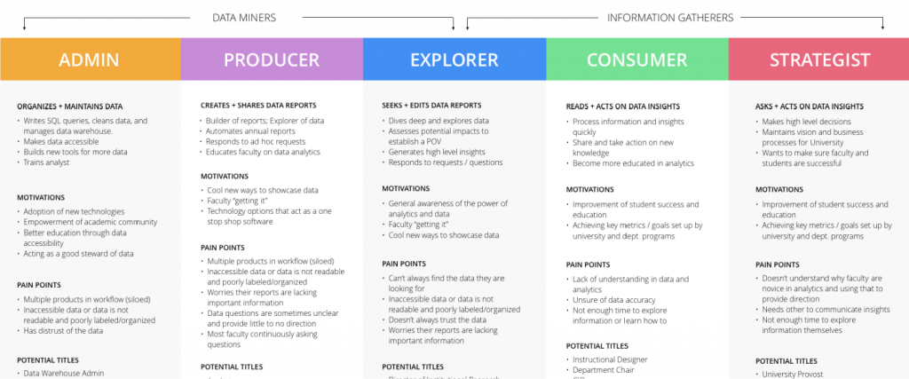
Diagram of refined user roles
Refined user understanding
We also used our research to identify and segment who our core users would be, what their pain points are, and how we might help them.
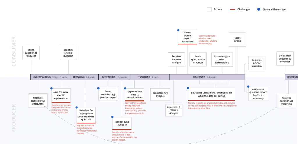
Diagram of user process for using data.
As-is lifecycle of a question
While each university and faculty member’s experience is unique and varies over time, some common actions and challenges exist over the course of a question turning into insight.
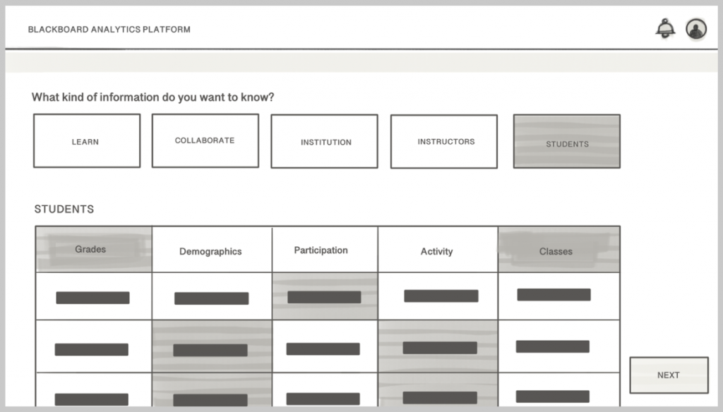
How might we create a data refinement and usage experience that is clear, easy, quick, and intuitive?
Principles & opportunities
Clarity
Design an experience that provides clarity and builds confidence in data. One that is easier communication (or intake) around questions and generated artifacts.
Ease of Finding
Consolidate tools into one place with all necessary features and functionalities. Provide report templates based on highest frequency that can be customizable.
Humanize
Hide complexity from the user so that they understand data in human terms.
Educate
Assist in data analytics education to novice academic faculty. Democratize data so the report producer is not the bottle neck.
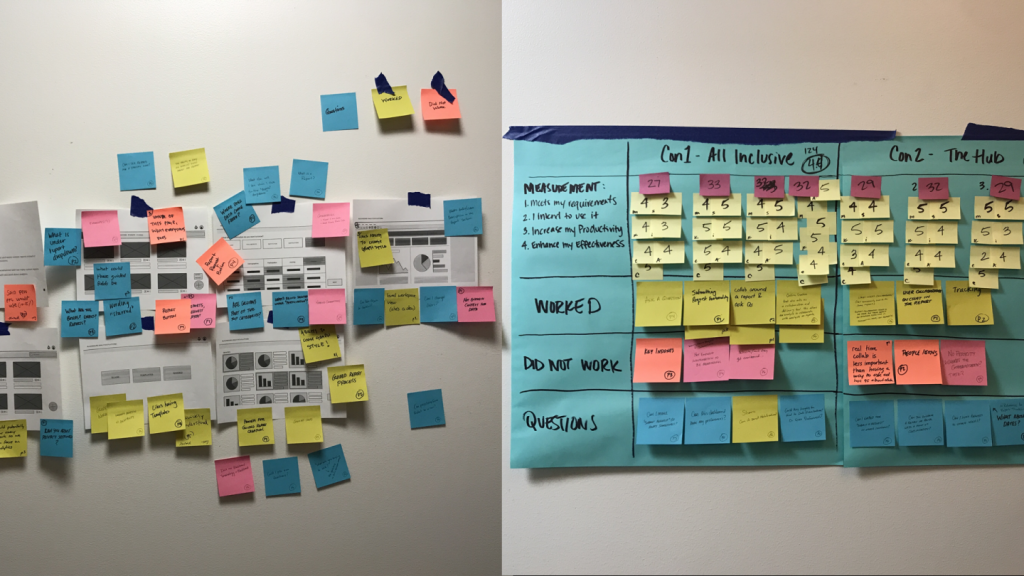
Photo of research notes on a whiteboard with paper UI mockups.
Concept Testing
All inclusive
Principles
Supportive
Informative
Transparent
Insight
The majority of academic faculty are unaware of the value of data. Faculty and decision makers don’t understand how to use analytics, or what the implications of that data might be.
Pain points
Repeated requests for custom reports.
Most faculty are continuously asking questions.
Strategists need all faculty to communicate insights.
The hub
Principles
Collaborative
Unrestricted
Adaptable
Insight
Learning Analytics is the Wild Wild West; there’s currently no standard reporting framework, so organizations build custom reports as questions/requests come in with many different tools.
Pain points
Multiple products in workflows.
Data is finicky & unorganized.
Majority of faculty are uneducated in analytics.
Not enough time to explore the information.
Choose your own adventure
Principles
Assistive
Informative
Control
Insight
Everybody’s special and wants custom reports instead of “out of the box.” Data consumers want reports specifically designed to answer their problem instead of a general report that requires seeking out more information.
Pain points
Analysts are overwhelmed with too many custom reports.
Faculty aren’t well educated about big data and analytics.
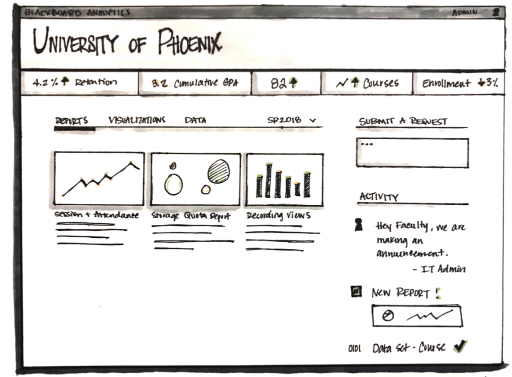
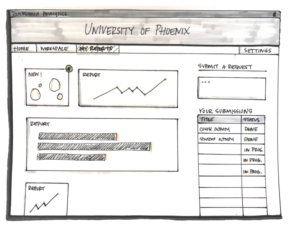
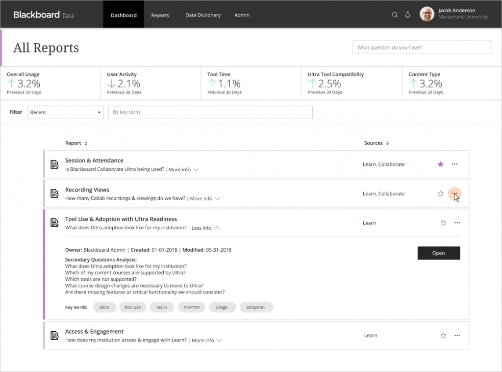
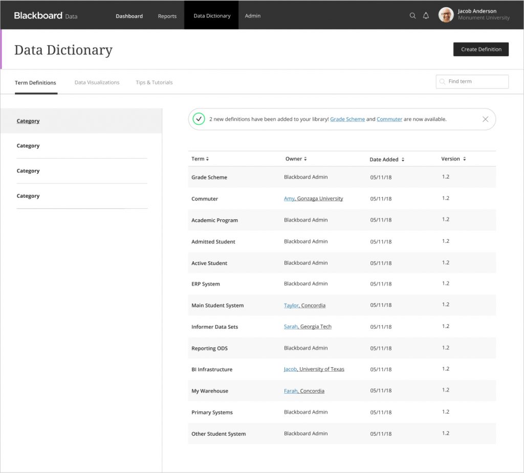
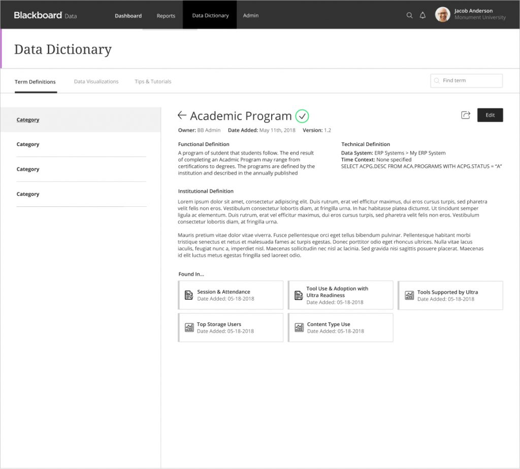
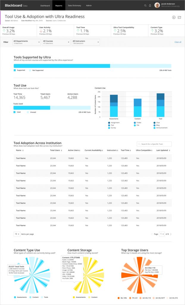
Design Work
Based on our findings during the concept phase, we began designing Blackboard Data.
Date:
January 28, 2019